I love photoshop. Period. It's incredible software and I find that it's been extremely beneficial in my photo-editing. However, I don't like to go too over the top with my editing. If I'm going for a vintage look, then I'm going for a vintage look. I'm not going to get to the point where my image has become posterized and grainy just to try to achieve the color effect I wanted. And I certainly don't want to make my images too over-edited, unless I'm going for such a look that it has to look that way (such as vintage, or cross-processed, etc....)
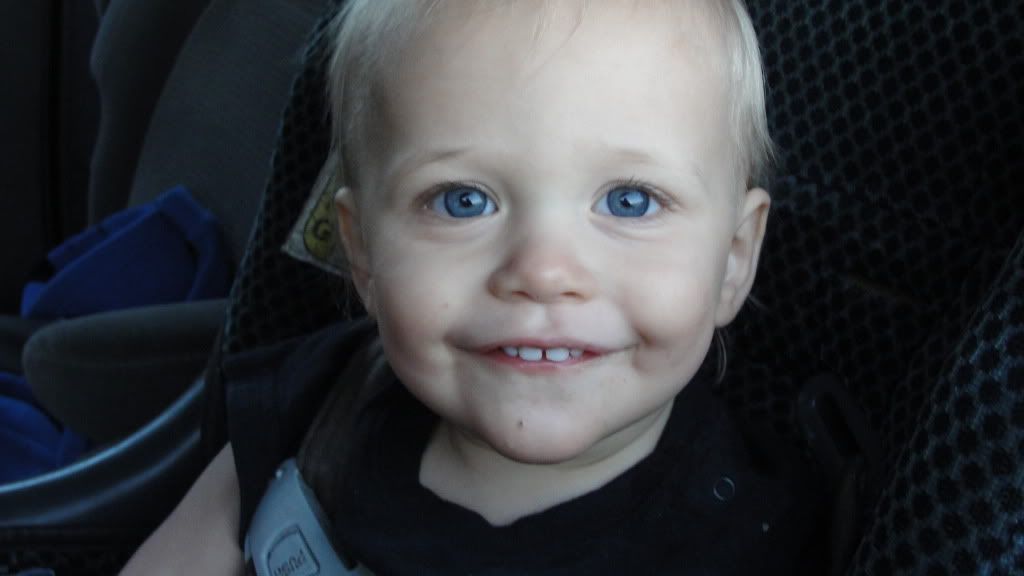
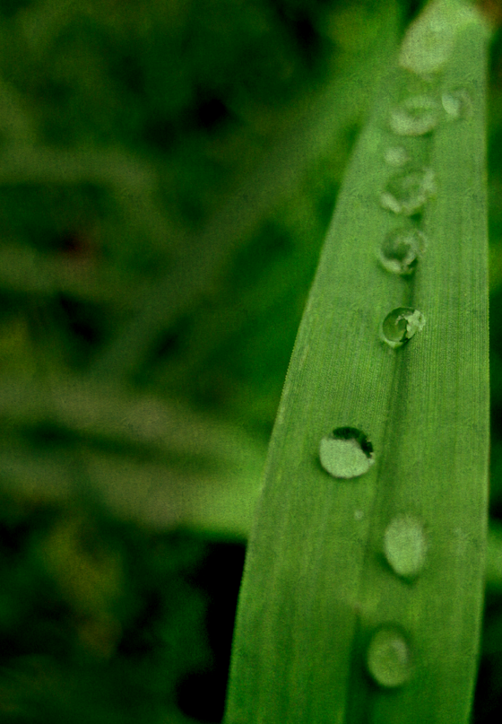
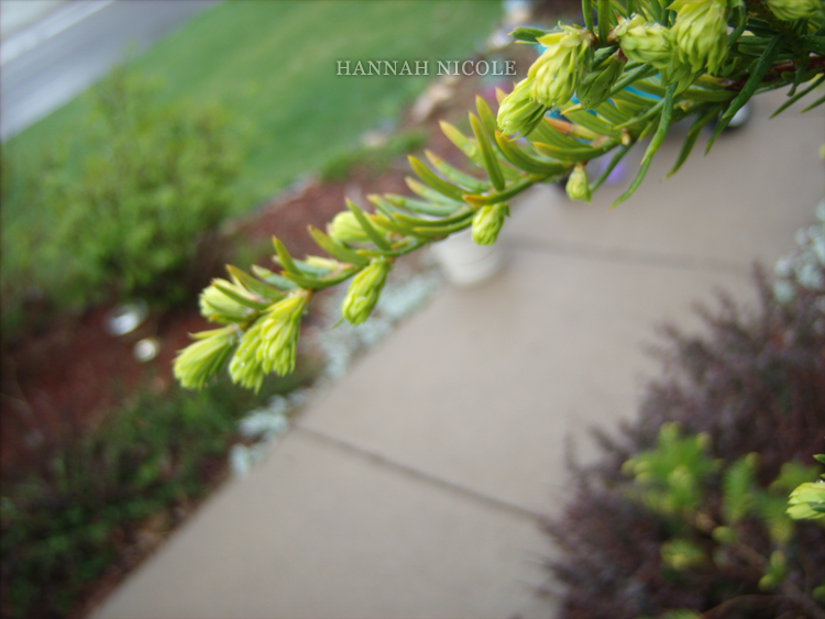
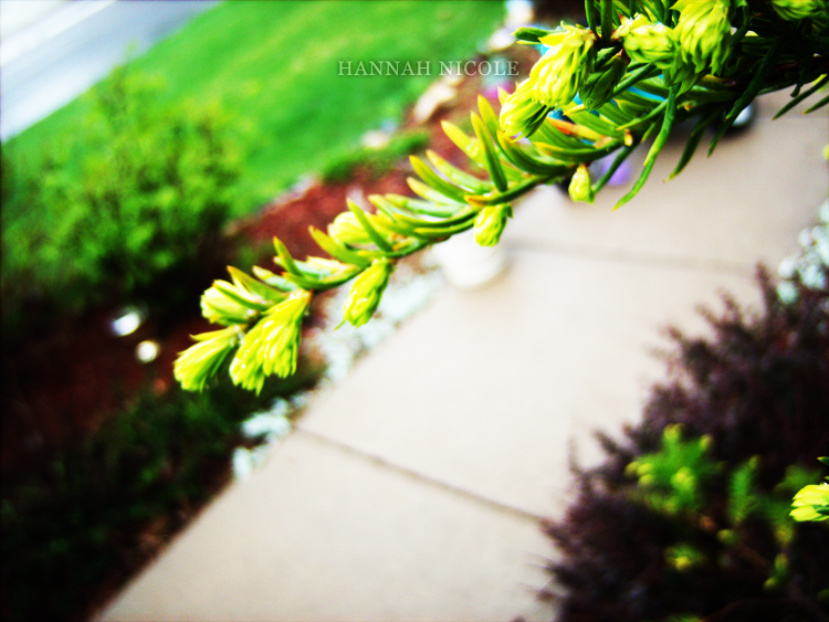
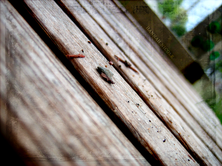
So here's my basic image. Unedited excepting the size. Not a bad photo by itself.
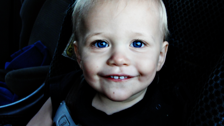
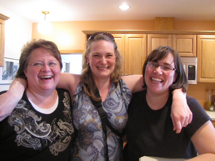
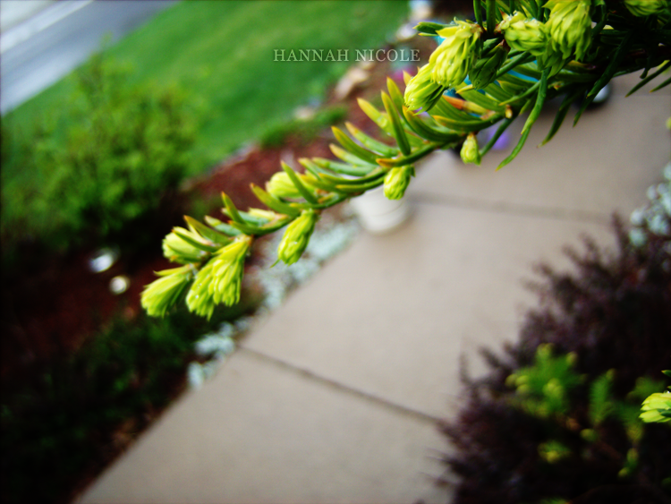
And here's my first edit. I played with the levels a bit, brightness/contrast, and duplicated my photo layer and set the duplicate onto soft light. It gives it more contrast and vivider colors without been too obviously edited.
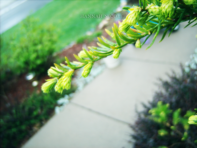
For my second edit, I just added two or so duplicate layers of the original image and set them onto soft light. Then, in between the two duplicate layers, I put a new layer and filled it with a blue tone and set that to soft light. I might have tampered with the opacity of that layer a bit. Not sure. This edit is a little strong (see top-right corner) but it works okay. In the future, I'd probably switch up the degree of the brightness/contrast and the opacity of the levels.
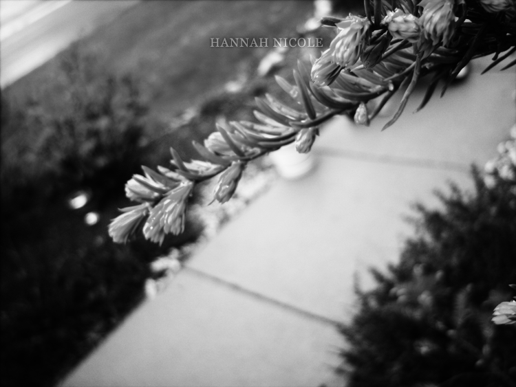
I don't really like this edit. Although black and white is a beautiful medium, for this image, it isn't working. Mainly because the focus of the photo is in the top-right corner, and with the black and white it's not as distinguishable. This one was a simple edit though. Black and white and then bumped up the contrast a little bit (I think).
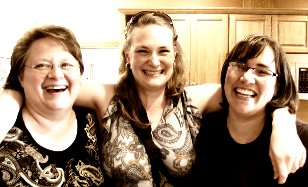
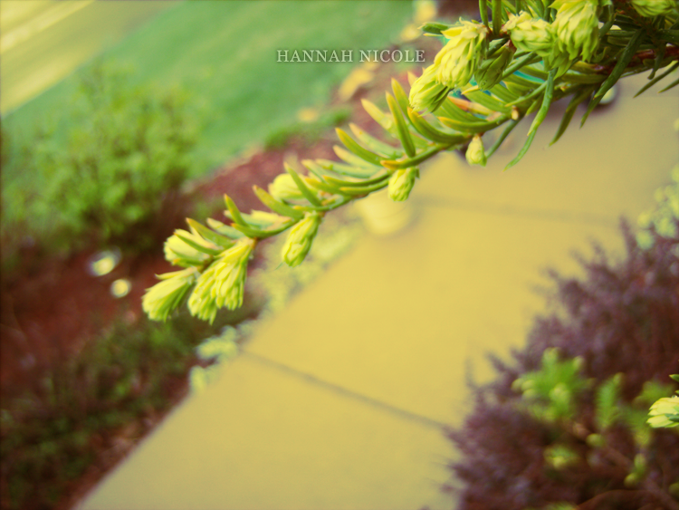
Now for this one, I was going for a vintage look. I added a layer and filled it with yellow, then added another layer and filled it with purple, and set them both to soft light. Then I messed around with the curves a lot to achieve that vintage effect. I'm pretty sure I did something with the brightness and contrast as well, and I might've added a duplicate layer of the original image between the yellow and purple layer.
Now that you've seen how I edit (some) of my pictures, here's how I try NOT to edit them like...
From far away, it doesn't look terrible, but I edited the brightness/contrast (and I think duplicated the original image/put it on soft light) so much that it's easy to tell that it's been (poorly) edited. I don't like images that are very over-edited...pretty much NO exceptions there. Also, it's getting posterized (again, see top-right corner) and that makes for a very fakey looking image.
So that's basically what I do. I have some actions that I've downloaded that I play with, but I do feel like I'm cheating whenever I use them. I've been trying to start editing from scratch...and it's pretty fun.
Have a happy editing day!